


Table of contents
Heikin Ashi candlesticks are a trading technique that originates from Japan; it looks very similar to the regular candlesticks, representing the Open, High, Low, Close (referred to as OHLC in this article), yet very different in practice.
How? Well, Heikin Ashi means average bar in Japanese, and they use the average prices of two time periods to construct candles on the chart. Let's look at the4H timeframe of AAPL with normal candles and Heikin Ashi candles. (Feel free to play around with charts, they are interactive)
Regular OHLC candle
Heikin Ashi Candle
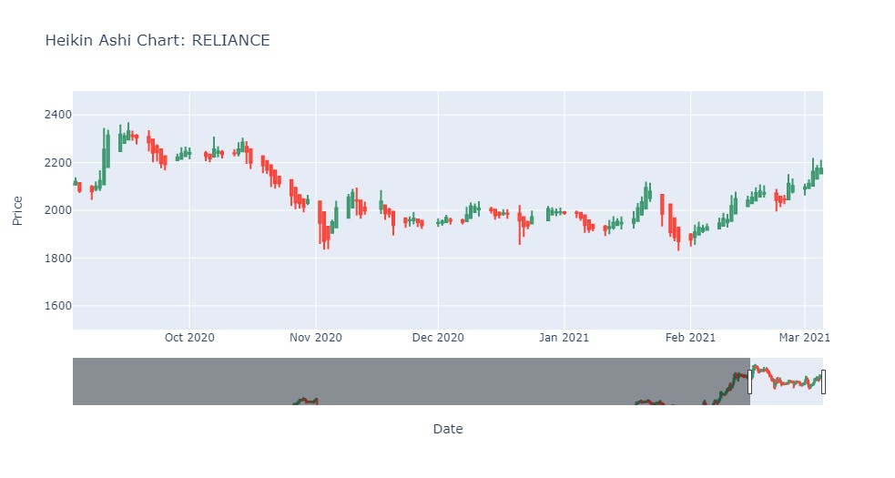
Do you see how noisy the first chart looks like when you compare it with the second? This is particularly the reason why Heikin Ashi candles have risen to their popularity. This charting technique reduces significant noise from your stock price movements; I think you can agree with me when I say that the second chart does a much better job of helping us identify the trend (up, down) trend reversals.
| Candle | Regular Candlestick | Heikin Ashi Candlestick |
| Open | Open0 | (HAOpen(-1) + HAClose(-1))/2 |
| High | High0 | MAX(High0, HAOpen0, HAClose0) |
| Low | Low0 | MIN(Low0, HAOpen0, HAClose0 |
| Close | Close0 | (Open0 + High0 + Low0 + Close0)/4 |
(-1) refers to the previous day, and HA refers to Heikin Ashi.
As you can note, the main difference in the above table is that Heikin Ashi uses the price data of two periods (T and T-1) to construct candles and takes averages of that which smooths the price movements making it easier to spot trends and reversals on the charts.
To be clear, I am not advocating that Heikin Ashi is a better charting method than your regular candlestick charts; both have their own advantages and disadvantages; I have particularly liked using Heikin Ashi in strategies that involve checking overall trends/reversals. 📈📉
You can read more about this charting method at Investopedia.
Python Implementation
Let's get into the fun part, how do you convert your existing stock prices dataframe to the Heikin Ashi Price dataframe. 🤔
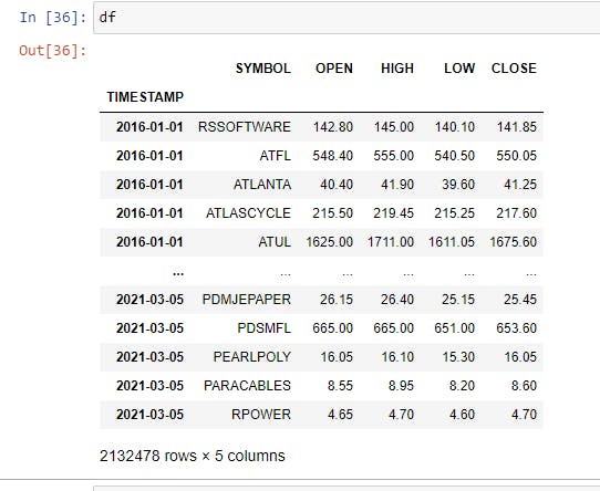
Step 1: Loading a sample Price File
I will be using a parquet file to load prices that I have saved; if you want to follow the tutorial with the same data, you can download the file from here. This data is the unadjusted stock prices for all stocks listed on NSE from 2016-2021.
Don't get intimidated by parquet files; you can use any other methods of loading the data into Python as long as that dataframe contains OPEN, HIGH, LOW, CLOSE columns as that's required to calculate Heikin Ashi prices. I personally use parquet because they can be compressed and shared easily.
import pandas as pd
import os
from datetime import datetime

#Loading the file.
df = pd.read_parquet('path/to/folder/final_nse_prices.parquet')

#Let's look at the first 5 rows
df.head()
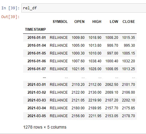
Let's filter these 2.1M+ rows of data for one single stock, which we can show as an example.
rel_df = df[df['SYMBOL'] == 'RELIANCE']
rel_df.head()
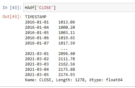
Step 2: Calculating Heikin Ashi Close Price
Why I choose to do the HAClose price first is because it uses all existing prices we have to be calculated, all other prices like HAOpen, HAHigh, and HALow require the input of HAClose.
HAClose = (Open0 + High0 + Low0 + Close0)/4
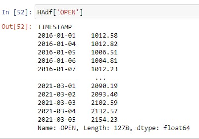
#assigning existing columns to new variable HAdf
HAdf = rel_df[['OPEN', 'HIGH', 'LOW', 'CLOSE']]

HAdf['CLOSE'] = round(((rel_df['OPEN'] + rel_df['HIGH'] + rel_df['LOW'] + rel_df['CLOSE'])/4),2)
#round function to limit results to 2 decimal places
Step 3: Calculating Heikin Ashi Open Price
Next, we need to do HAOpen price since this is used as an input in HAHigh and HALow.
HAOpen = (HAOpen(-1) + HAClose(-1))/2
As you note from the formula above, it uses the price from the previous time period, but we would not have that for the very first entry in our dataframe, which is 2016-01-01. In this case, we will take the average of Open and Close for the day.
for i in range(len(rel_df)):
    if i == 0:
        HAdf.iat[0,0] = round(((rel_df['OPEN'].iloc[0] + rel_df['CLOSE'].iloc[0])/2),2)
    else:
        HAdf.iat[i,0] = round(((HAdf.iat[i-1,0] + HAdf.iat[i-1,3])/2),2)
So, what's happening in the above is very simple but may look confusing; it certainly did to me at the start. We want to calculate the Open price for all the rows; starting with the first row, we give it an average value of OPEN and CLOSE from the rel_df dataframe; this is ensured by the i == 0 condition. **Remember, the index always starts at ZERO instead of ONE. **
For all the other rows, we are basically taking the previous value of OPEN and CLOSE in the HAdf dataframe. The .iat[i-1,0] refers to previous entry in OPEN and .iat[i-1,3] refers to previous entry in CLOSE column.
Step 4: Calculating Heikin Ashi High & Low Price
HAHigh and HALow are straightforward to calculate now, given we have all the necessary data points.
High = MAX(High0, HAOpen0, HAClose0)
Low = MIN(Low0, HAOpen0, HAClose0
#Taking the Open and Close columns we worked on in Step 2 & 3
#Joining this data with the existing HIGH/LOW data from rel_df
#Taking the max value in the new row with columns OPEN, CLOSE, HIGH
#Assigning that value to the HIGH/LOW column in HAdf
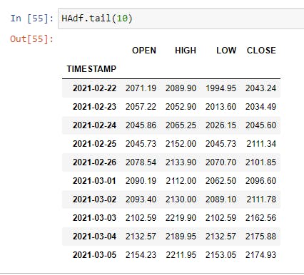
HAdf['HIGH'] = HAdf.loc[:,['OPEN', 'CLOSE']].join(rel_df['HIGH']).max(axis=1)
HAdf['LOW'] = HAdf.loc[:,['OPEN', 'CLOSE']].join(rel_df['LOW']).min(axis=1)
HAdf.tail(10)
Step 5: Plotting the existing candlestick and Heikin Ashi Candlestick using Plotly
It is always good to visualize how your data looks like after you have done processing it; for this, we will use plotly, if you do not have plotly installed, now is the time to run conda install plotly or pip install plotly in your console.
import plotly.graph_objects as go

fig1 = go.Figure(data=[go.Candlestick(x=rel_df.index,
                open=rel_df.OPEN,
                high=rel_df.HIGH,
                low=rel_df.LOW,
                close=rel_df.CLOSE)])

fig1.update_layout(yaxis_range = [1500,2500],
           title = 'Candlestick Chart: RELIANCE',
           xaxis_title = 'Date',
           yaxis_title = 'Price')
fig1.show()
If you are using Jupyter notebook, the output will be an interactive chart; I have filtered the chart to show data from Sep 2020 to March 2021 in the below figure.
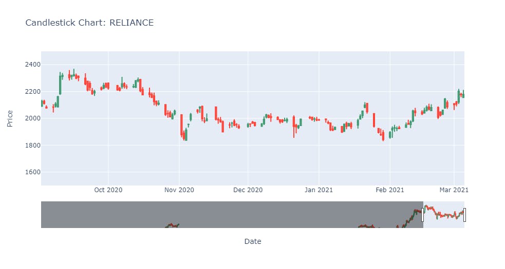
fig2 = go.Figure(data=[go.Candlestick(x=HAdf.index,
                open=HAdf.OPEN,
                high=HAdf.HIGH,
                low=HAdf.LOW,
                close=HAdf.CLOSE)] )


fig2.update_layout(yaxis_range = [1500,2500],
          title = 'Heikin Ashi Chart: RELIANCE',
          xaxis_title = 'Date',
          yaxis_title = 'Price')
fig2.show()
Great job 🥂 You can do this for any of the 2000+ stocks I have shared the data for or any other stock as long as they have the **open, high, low, and close columns. **
I have also put up a much better version on Github here where you need to call the function and give it a dataframe, and it will return the Heikin Ashi dataframe to you. If you like this piece of code, don't forget to 🌟 (star) it.
Please drop in any suggestions/questions you have to me on Twitter or Linkedin; I would be more than happy to assist you and get your feedback to make my future articles better. Also, do consider subscribing to my newsletter 📬 to get regular updates.
If you like it up till now, consider buying me a coffee ☕ by clicking here or the button below.